By David M. Berry
~
The world is flat.[1] 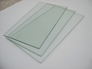 Or perhaps better, the world is increasingly “layers.” Certainly the augmediated imaginaries of the major technology companies are now structured around a post-retina vision of mediation made possible and informed by the digital transformations ushered in by mobile technologies – whether smartphones, wearables, beacons or nearables – an internet of places and things. These imaginaries provide a sense of place, as well as sense for management, of the complex real-time streams of information and data broken into shards and fragments of narrative, visual culture, social media and messaging. Turned into software, they reorder and re-present information, decisions and judgment, amplifying the sense and senses of (neoliberal) individuality whilst reconfiguring what it means to be a node in the network of post digital capitalism. These new imaginaries serve as abstractions of abstractions, ideologies of ideologies, a prosthesis to create a sense of coherence and intelligibility in highly particulate computational capitalism (Berry 2014). To explore the experimentation of the programming industries in relation to this it is useful to explore the design thinking and material abstractions that are becoming hegemonic at the level of the interface.
Two new competing computational interface paradigms are now deployed in the latest version of Apple and Google’s operating systems, but more notably as regulatory structures to guide the design and strategy related to corporate policy. The first is “flat design” which has been introduced by Apple through iOS 8 and OS X Yosemite as a refresh of the aging operating systems’ human computer interface guidelines, essentially stripping the operating system of historical baggage related to techniques of design that disguised the limitations of a previous generation of technology, both in terms of screen but also processor capacity. It is important to note, however, that Apple avoids talking about “flat design” as its design methodology, preferring to talk through its platforms specificity, that is about iOS’ design or OS X’s design. The second is “material design” which was introduced by Google into its Android L, now Lollipop, operating system and which also sought to bring some sense of coherence to a multiplicity of Android devices, interfaces, OEMs and design strategies. More generally “flat design” is “the term given to the style of design in which elements lose any type of stylistic characters that make them appear as though they lift off the page” (Turner 2014). As Apple argues, one should “reconsider visual indicators of physicality and realism” and think of the user interface as “play[ing] a supporting role”, that is that techniques of mediation through the user interface should aim to provide a new kind of computational realism that presents “content” as ontologically prior to, or separate from its container in the interface (Apple 2014). This is in contrast to “rich design,” which has been described as “adding design ornaments such as bevels, reflections, drop shadows, and gradients” (Turner 2014).
 I want to explore these two main paradigms – and to a lesser extent the flat-design methodology represented in Windows 7 and the, since renamed, Metro interface – through a notion of a comprehensive attempt by both Apple and Google to produce a rich and diverse umwelt, or ecology, linked through what what Apple calls “aesthetic integrity” (Apple 2014). This is both a response to their growing landscape of devices, platforms, systems, apps and policies, but also to provide some sense of operational strategy in relation to computational imaginaries. Essentially, both approaches share an axiomatic approach to conceptualizing the building of a system of thought, in other words, a primitivist predisposition which draws from both a neo-Euclidian model of geons (for Apple), but also a notion of intrinsic value or neo-materialist formulations of essential characteristics (for Google). That is, they encapsulate a version of what I am calling here flat theory. Both of these companies are trying to deal with the problematic of multiplicities in computation, and the requirement that multiple data streams, notifications and practices have to be combined and managed within the limited geography of the screen. In other words, both approaches attempt to create what we might call aggregate interfaces by combining techniques of layout, montage and collage onto computational surfaces (Berry 2014: 70).
The “flat turn” has not happened in a vacuum, however, and is the result of a new generation of computational hardware, smart silicon design and retina screen technologies. This was driven in large part by the mobile device revolution which has not only transformed the taken-for-granted assumptions of historical computer interface design paradigms (e.g. WIMP) but also the subject position of the user, particularly structured through the Xerox/Apple notion of single-click functional design of the interface. Indeed, one of the striking features of the new paradigm of flat design, is that it is a design philosophy about multiplicity and multi-event. The flat turn is therefore about modulation, not about enclosure, as such, indeed it is a truly processual form that constantly shifts and changes, and in many ways acts as a signpost for the future interfaces of real-time algorithmic and adaptive surfaces and experiences. The structure of control for the flat design interfaces is following that of the control society, is “short-term and [with] rapid rates of turnover, but also continuous and without limit” (Deleuze 1992). To paraphrase Deleuze: Humans are no longer in enclosures, certainly, but everywhere humans are in layers.
Apple uses a series of concepts to link its notion of flat design which include, aesthetic integrity, consistency, direct manipulation, feedback, metaphors, and user control (Apple 2014). Reinforcing the haptic experience of this new flat user interface has been described as building on the experience of “touching glass” to develop the “first post-Retina (Display) UI (user interface)” (Cava 2013). This is the notion of layered transparency, or better, layers of glass upon which the interface elements are painted through a logical internal structure of Z-axis layers. This laminate structure enables meaning to be conveyed through the organization of the Z-axis, both in terms of content, but also to place it within a process or the user interface system itself.
Google, similarly, has reorganized it computational imaginary around a flattened layered paradigm of representation through the notion of material design. Matias Duarte, Google’s Vice President of Design and a Chilean computer interface designer, declared that this approach uses the notion that it “is a sufficiently advanced form of paper as to be indistinguishable from magic” (Bohn 2014). But magic which has constraints and affordances built into it, “if there were no constraints, it’s not design — it’s art” Google claims (see Interactive Material Design) (Bohn 2014). Indeed, Google argues that the “material metaphor is the unifying theory of a rationalized space and a system of motion”, further arguing:
The fundamentals of light, surface, and movement are key to conveying how objects move, interact, and exist in space and in relation to each other. Realistic lighting shows seams, divides space, and indicates moving parts… Motion respects and reinforces the user as the prime mover… [and together] They create hierarchy, meaning, and focus (Google 2014).
This notion of materiality is a weird materiality in as much as Google “steadfastly refuse to name the new fictional material, a decision that simultaneously gives them more flexibility and adds a level of metaphysical mysticism to the substance. That’s also important because while this material follows some physical rules, it doesn’t create the “trap” of skeuomorphism. The material isn’t a one-to-one imitation of physical paper, but instead it’s ‘magical’” (Bohn 2014). Google emphasises this connection, arguing that “in material design, every pixel drawn by an application resides on a sheet of paper. Paper has a flat background color and can be sized to serve a variety of purposes. A typical layout is composed of multiple sheets of paper” (Google Layout, 2014). The stress on material affordances, paper for Google and glass for Apple are crucial to understanding their respective stances in relation to flat design philosophy.[2]
- Glass (Apple): Translucency, transparency, opaqueness, limpidity and pellucidity.
- Paper (Google): Opaque, cards, slides, surfaces, tangibility, texture, lighted, casting shadows.
Paradigmatic Substances for Materiality
In contrast to the layers of glass 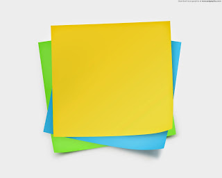 that inform the logics of transparency, opaqueness and translucency of Apple’s flat design, Google uses the notion of remediated “paper” as a digital material, that is this “material environment is a 3D space, which means all objects have x, y, and z dimensions. The z-axis is perpendicularly aligned to the plane of the display, with the positive z-axis extending towards the viewer. Every sheet of material occupies a single position along the z-axis and has a standard 1dp thickness” (Google 2014). One might think then of Apple as painting on layers of glass, and Google as thin paper objects (material) placed upon background paper. However a key difference lies in the use of light and shadow in Google’s notion which enables the light source, located in a similar position to the user of the interface, to cast shadows of the material objects onto the objects and sheets of paper that lie beneath them (see Jitkoff 2014). Nonetheless, a laminate structure is key to the representational grammar that constitutes both of these platforms.
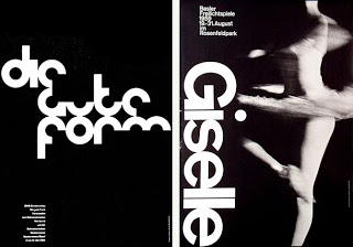
Interestingly, both design strategies emerge from an engagement with and reconfiguration of the principles of design that draw from the Swiss style (sometimes called the International Typographic Style) in design (Ashghar 2014, Turner 2014).[3] This approach emerged in the 1940s, and
mainly focused on the use of grids, sans-serif typography, and clean hierarchy of content and layout. During the 40’s and 50’s, Swiss design often included a combination of a very large photograph with simple and minimal typography (Turner 2014).
The design grammar of the Swiss style has been combined with minimalism and the principle of “responsive design”, that is that the materiality and specificity of the device should be responsive to the interface and context being displayed. Minimalism is a “term used in the 20th century, in particular from the 1960s, to describe a style characterized by an impersonal austerity, plain geometric configurations and industrially processed materials” (MoMA 2014).
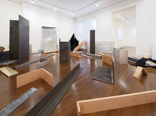
Robert Morris, one of the principle artists of Minimalism, and author of the influential Notes on Sculpture used “simple, regular and irregular polyhedrons. Influenced by theories in psychology and phenomenology” which he argued “established in the mind of the beholder ‘strong gestalt sensation’, whereby form and shape could be grasped intuitively” (MoMA 2014).[4]
The implications of these two competing world-views are far-reaching in that much of the worlds initial contact, or touch points, for data services, real-time streams and computational power is increasingly through the platforms controlled by these two companies. However, they are also deeply influential across the programming industries, and we see alternatives and multiple reconfigurations in relation to the challenge raised by the “flattened” design paradigms. That is, they both represent, if only in potentia, a situation of a power relation and through this an ideological veneer on computation more generally. Further, with the proliferation of computational devices – and the screenic imaginary associated with them in the contemporary computational condition – there appears a new logic which lies behind, justifies and legitimates these design methodologies.
It seems to me that these new flat design philosophies, in the broad sense, produce an order in precepts and concepts in order to give meaning and purpose not only in the interactions with computational platforms, but also more widely in terms of everyday life. Flat design and material design are competing philosophies that offer alternative patterns of both creation and interpretation, which are meant to have not only interface design implications, but more broadly in the ordering of concepts and ideas, the practices and the experience of computational technologies broadly conceived. Another way to put this could be to think about these moves as being a computational founding, the generation of, or argument for, an axial framework for building, reconfiguration and preservation.
Indeed, flat design provides and more importantly serves, as a translational or metaphorical heuristic for both re-presenting the computational, but also teaches consumers and users how to use and manipulate new complex computational systems and stacks. In other words, in a striking visual technique flat design communicates the vertical structure of the computational stack, on which the Stack corporations are themselves constituted. But also begins to move beyond the specificity of the device as privileged site of a computational interface interaction from beginning to end. For example, interface techniques are abstracted away from the specificity of the device, for example through Apple’s “handoff” continuity framework which also potentially changes reading and writing practices in interesting ways and new use-cases for wearables and nearables.
These new interface paradigms, introduced by the flat turn, have very interesting possibilities for the application of interface criticism, through unpacking and exploring the major trends and practices of the Stacks, that is, the major technology companies. I think that further than this, the notion of layers are instrumental in mediating the experience of an increasingly algorithmic society (e.g. think dashboards, personal information systems, quantified self, etc.), and as such provide an interpretative frame for a world of computational patterns but also a constituting grammar for building these systems in the first place. There is an element in which the notion of the postdigital may also be a useful way into thinking about the question of the link between art, computation and design given here (see Berry and Dieter, forthcoming) but also the importance of notions of materiality for the conceptualization deployed by designers working within both the flat design and material design paradigms – whether of paper, glass, or some other “material” substance.[5]
_____
David M. Berry is Reader in the School of Media, Film and Music at the University of Sussex. He writes widely on computation and the digital and blogs at Stunlaw. He is the author of Critical Theory and the Digital, The Philosophy of Software: Code and Mediation in the Digital Age , Copy, Rip, Burn: The Politics of Copyleft and Open Source, editor of Understanding Digital Humanities and co-editor of Postdigital Aesthetics: Art, Computation And Design. He is also a Director of the Sussex Humanities Lab.
Back to the essay
_____
Notes
[1] Many thanks to Michael Dieter and Søren Pold for the discussion which inspired this post.
[2] The choice of paper and glass as the founding metaphors for the flat design philosophies of Google and Apple raise interesting questions for the way in which these companies articulate the remediation of other media forms, such as books, magazines, newspapers, music, television and film, etc. Indeed, the very idea of “publication” and the material carrier for the notion of publication is informed by the materiality, even if only a notional affordance given by this conceptualization. It would be interesting to see how the book is remediated through each of the design philosophies that inform both companies, for example.
[3] One is struck by the posters produced in the Swiss style which date to the 1950s and 60s but which today remind one of the mobile device screens of the 21st Century.
[4] There is also some interesting links to be explored between the Superflat style and postmodern art movement, founded by the artist Takashi Murakami, which is influenced by manga and anime, both in terms of the aesthetic but also in relation to the cultural moment in which “flatness” is linked to “shallow emptiness.”
[5] There is some interesting work to be done in thinking about the non-visual aspects of flat theory, such as the increasing use of APIs, such as the RESTful api, but also sound interfaces that use “flat” sound to indicate spatiality in terms of interface or interaction design. There are also interesting implications for the design thinking implicit in the Apple Watch, and the Virtual Reality and Augmented Reality platforms of Oculus Rift, Microsoft HoloLens, Meta and Magic Leap.
Bibliography
- Apple (2014) iOS Human Interface Guidelines, accessed 13/11/2014, https://developer.apple.com/library/ios/documentation/userexperience/conceptual/mobilehig/Navigation.html
- Ashghar, T. (2014) The True History Of Flat Design, accessed 13/11/2014, http://www.webdesignai.com/flat-design-history/
- Berry, D. M. (2014) Critical Theory and the Digital, New York: Bloomsbury.
- Berry, D. M. and Dieter, M. (forthcoming) Postdigital Aesthetics: Art, Computation and Design, Basingstoke: Palgrave Macmillan.
- Bohn, D. (2014) Material world: how Google discovered what software is made of, The Verge, accessed 13/11/2014, http://www.theverge.com/2014/6/27/5849272/material-world-how-google-discovered-what-software-is-made-of
- Cava, M. D. (2013) Jony Ive: The man behind Apple’s magic curtain, USA Today, accessed 1/1/2014, http://www.usatoday.com/story/tech/2013/09/19/apple-jony-ive-craig-federighi/2834575/
- Deleuze, G. (1992) Postscript on the Societies of Control, October, vol. 59: 3-7.
- Google (2014) Material Design, accessed 13/11/2014, http://www.google.com/design/spec/material-design/introduction.html
- Google Layout (2014) Principles, Google, accessed 13/11/2014, http://www.google.com/design/spec/layout/principles.html
- Jitkoff, N. (2014) This is Material Design, Google Developers Blog, accessed 13/11/2014, http://googledevelopers.blogspot.de/2014/06/this-is-material-design.html
- MoMA (2014) Minimalism, MoMA, accessed 13/11/2014, http://www.moma.org/collection/details.php?theme_id=10459
- Turner, A. L. (2014) The history of flat design: How efficiency and minimalism turned the digital world flat, The Next Web, accessed 13/11/2014, http://thenextweb.com/dd/2014/03/19/history-flat-design-efficiency-minimalism-made-digital-world-flat/